Rose of Ultramarine + Green Gold: An Unexpected Watercolour Combination
I have been having way too much fun lately experimenting with unexpected two-colour watercolour combinations, and this one surprised me in the best way.
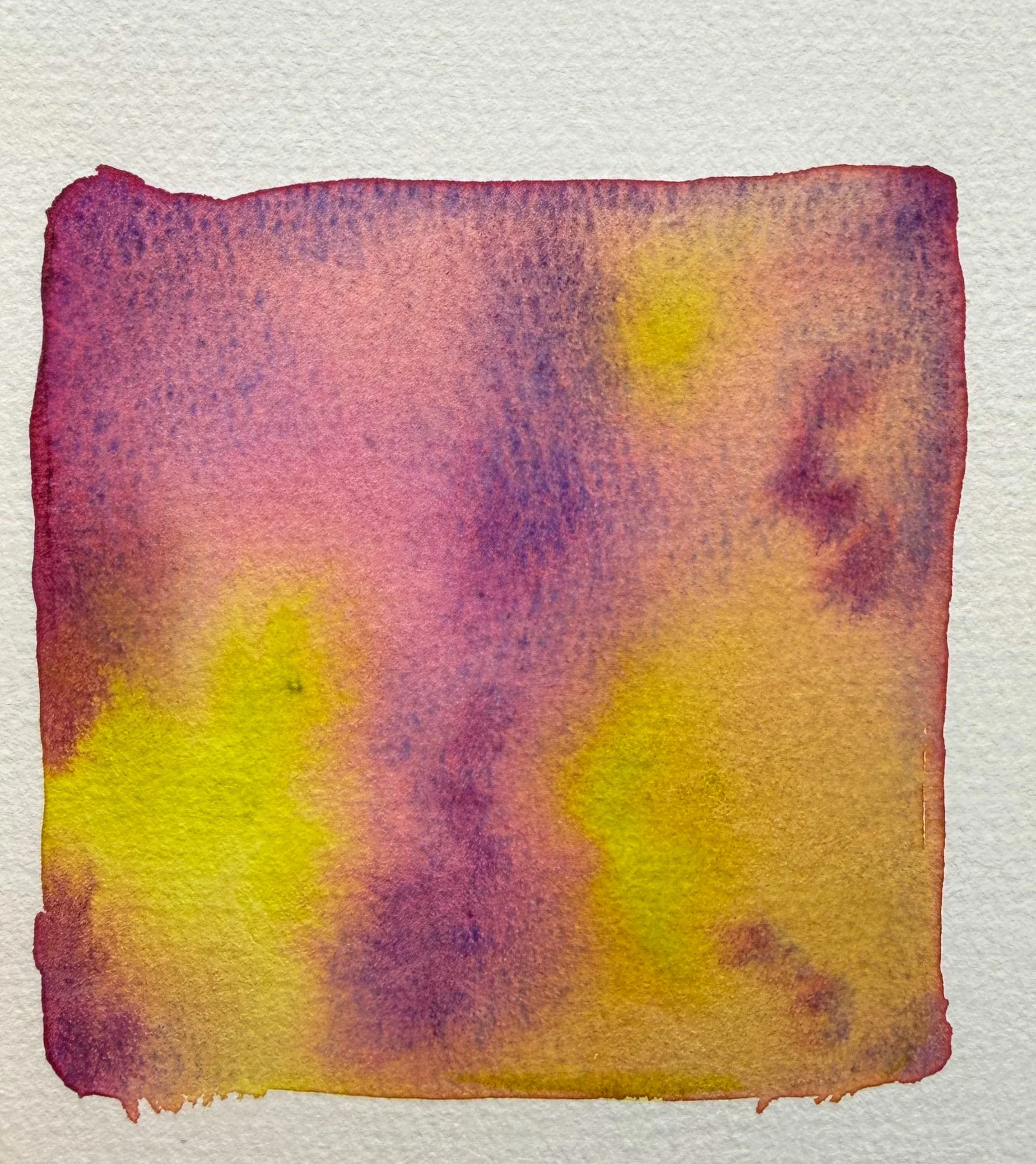
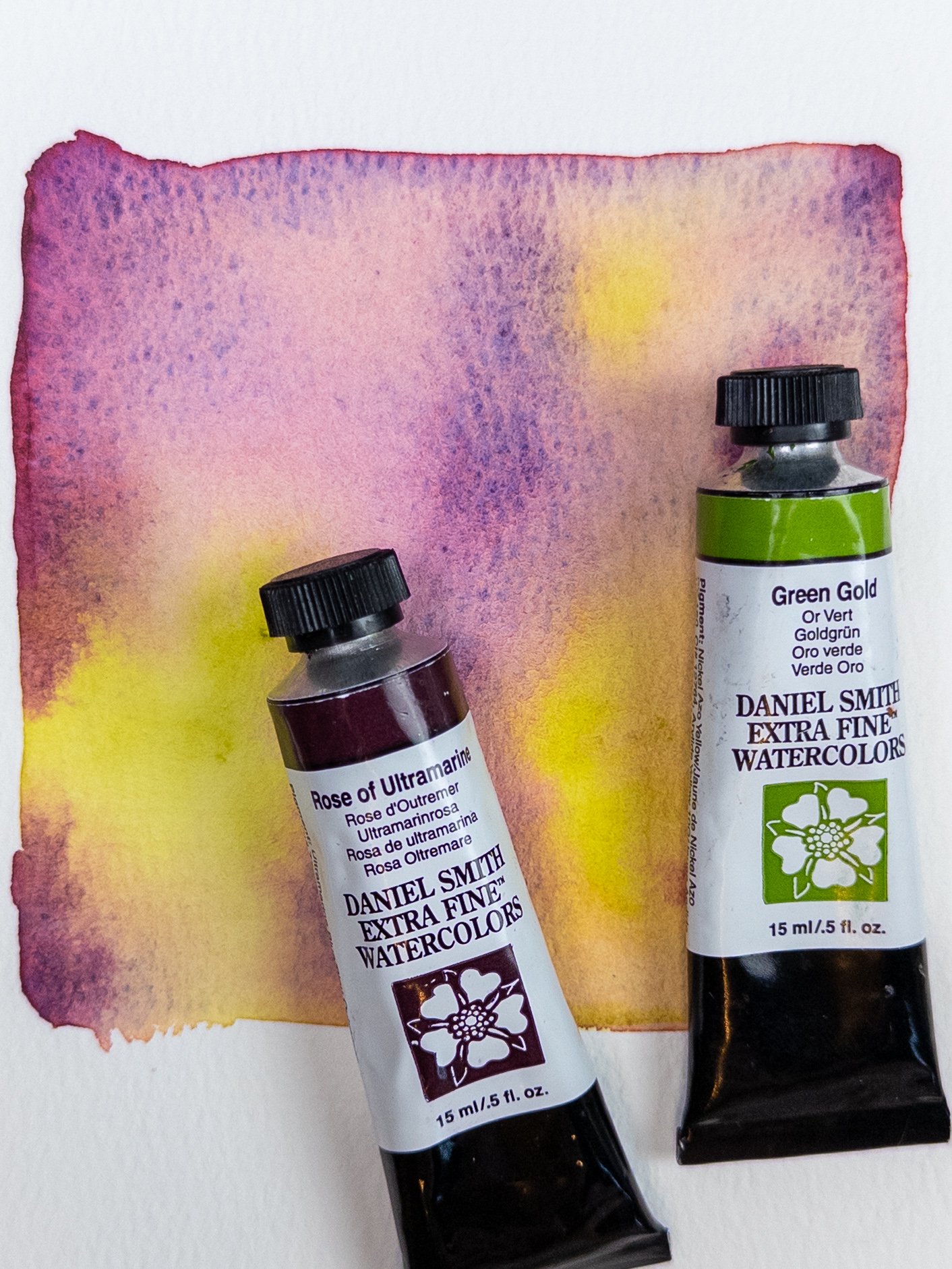
For this swatch, I used Daniel Smith Rose of Ultramarine and Green Gold.
At first glance, these are not two colours I would automatically think to pair together. Rose of Ultramarine is soft, rosy, violet, and beautifully granulating, while Green Gold is bright, luminous, and almost electric in comparison.
But once they started moving into each other on the paper, they created a surprisingly harmonious mix.
The colours they create together
What I love most about this combination is the range of colour that appears from only two tubes.
The Rose of Ultramarine brings in soft pinks, mauves, violets, and subtle blue granulation, while the Green Gold adds glowing yellow-green areas and warm golden tones.
Where the two colours overlap, they create muted earthy shades that shift between dusty mauve, olive, warm brown, and soft neutral tones.
The result feels both luminous and moody at the same time.
It reminds me of moss, lichen, faded flowers, weathered stone, and the strange colours you sometimes find in nature when you stop looking for perfectly recognizable greens and purples.
Why Rose of Ultramarine is so interesting
Rose of Ultramarine is already a fascinating colour on its own because it has visible variation within the wash.
Instead of drying as one completely uniform purple-pink colour, it can separate into warmer rose tones and cooler blue-violet granulation.
That built-in movement becomes even more noticeable when it is paired with something as bright as Green Gold.
The cooler violet areas create contrast against the yellow-green, while the softer pink portions help bridge the two colours together.
Why Green Gold works with it
Green Gold is one of those colours that can look almost startlingly bright when used straight from the palette.
In this swatch, that brightness is exactly what makes the combination interesting.
Rather than disappearing completely into the Rose of Ultramarine, some areas remain luminous and almost glowing. In other places, the Green Gold softens into warm yellow, olive, and earthy neutral shades.
That contrast between bright green-gold and dusty violet gives the swatch much more depth than I expected.
How I made this swatch
I used plenty of water and allowed the two colours to move into one another naturally rather than mixing them completely beforehand.
I added Rose of Ultramarine in several areas and Green Gold in others, allowing the edges to meet while still leaving pockets of each colour visible.
Then I mostly left the pigments alone.
This is my favourite way to experiment with combinations like this because the interesting part is watching the pigments decide what they want to do.
The less I interfere, the more beautiful little transitions, blooms, and granulating textures seem to appear.
What could you paint with Rose of Ultramarine and Green Gold?
After seeing the finished swatch, I immediately started imagining this as a limited two-colour palette.
I think it would be especially beautiful for:
loose florals
wildflower fields
mossy landscapes
misty forests
botanical paintings
old stone walls covered in lichen
abstract watercolour
dreamy or atmospheric landscapes
The Green Gold could create glowing foliage and light, while Rose of Ultramarine could be used for flowers, distant shadows, skies, and darker areas.
The mixed colours would give you all the softer neutrals needed to connect everything together.
An unexpectedly beautiful pairing
This is exactly why I love experimenting with colour.
Sometimes the combinations I would never have chosen instinctively turn out to be the most interesting.
Rose of Ultramarine and Green Gold may seem like an unusual pairing, but together they create a palette full of glowing yellow-green, dusty pink, violet, mauve, olive, and earthy neutral tones.
And now, of course, I need to paint something using only these two colours.
Because apparently making the swatch was not enough. 🎨